Behind the scenes of the WW3 Arabic font creation
Get behind the scenes and discover how we collaborated with type designer Ibrahim Hamdy on two fonts for our next game: World War 3.
The concept
With the recent reveal of our upcoming, World War 3, we thought it would be interesting to give you a behind the scenes on how we are working on adapting this title for Arabic world, starting with an important topic: the brand fonts.
You might wonder, a dedicated font for a game is probably the least important thing in the production cycle. But in the Arabic world, publishers rarely create a font that matches their game’s brand guidelines, and that’s because most main fonts are focused on working for Cyrillic and Latin-based languages. When you look at most major companies, only a handful of them have one dedicated for the Arabic language, such as Ubisoft’s corporate font, which features some inspiration from Noto Kufi and SST known fonts.
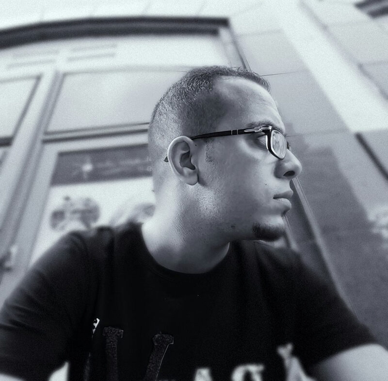
To work on the task of crafting a font for World War 3, we scouted a handful of known agencies and designers in the Arab world, and eventually found the perfect one. Our team collaborated with Ibrahim Hamdy, an Egyptian Typography and Graphic Designer known for his fan-art on transforming iconic game logos in Arabic, featured in the press in publications like Kotaku. His passion for gaming, understanding of the key needs of a font in games and out-of-game content helped our team decide on pitching our project to him quite easily.
The artist: Ibrahim Hamdy
An Egypt-based graphic and type designer, Ibrahim Hamdy has been known in the industry for creating some interesting commercial typeface including Lavah Pro, Siwa, Eskander and many more in his co-founded firm His full name is Ibrahim Hamdi Mohamed Ali, and his company is called Protype Foundry. His passion for the gaming industry has led him to create fan-inspired rendition of iconic game franchise logos and was featured in Kotaku to name a few. You can check his portfolio on Behance.
The research phase and inspiration from the western font
WW3 Inktrap and WW3 Sans fonts are both an exclusive typeface family made for World War 3. This is the collective work of our partners at MY.GAMES Games Operations and Development Department’ in-house design team in partnership with seasoned typeface designer Tanya Cherkiz in 2021. We’ve designed two weights (regular and bold) with Cyrillics and Extended Latin character support.
First of all, they thought of a gothic and sans-serif font with an industrial feel, but without strong military or sci-fi connotations. Something realistic that you can see in real life — like the typography on car number plates or street signs. This urban feel is in line with most World War 3 locations. Following that, the typeface was updated to be distinctive, so we can use it as an essential and notable part of the game's visual identity.
First of all, they thought of a gothic and sans-serif font with an industrial feel, but without strong military or sci-fi connotations. Something realistic that you can see in real life — like the typography on car number plates or street signs. This urban feel is in line with most World War 3 locations. Following that, the typeface was updated to be distinctive, so we can use it as an essential and notable part of the game's visual identity.
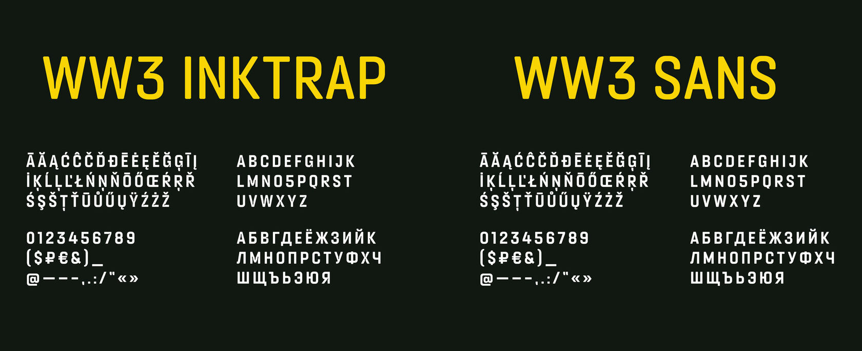
The team decided that a specific & distinguishing look and feel could be reached by adding inktraps, a notable trend in graphic design over the last two years. However, it’s usage is not widespread and common in the gaming industry, and there aren’t many inktrap fonts with Cyrillic support. Moreover, inktraps historically were invented as a purely utilitarian need, which stand in line with the military tactic-oriented shooter brand.
They knew that large, really big and bold typography would be one of the graphical pillars in our visual identity, so they gave it rounded edges to all symbols. Making it almost invisible in small and medium font sizes, but on a large scale it gives this extra detail to the typography.
The typeface was also conceived to be equally good for large heading usage as well as for base text. Inktraps are optional, so in paragraphs with small font size we don’t use them to ensure best possible readability.
the fundamental design choices in Arabic fonts
When adapting a font into Arabic, the first question to answer is how create that is a distinctive, yet consistent in terms of brand guidelines with the original Latin one. There are obviously more challenges to tackle, such as text weight once translating sentences, readability (easy to read and understand) and legibility in different environments (bright vs. dark backgrounds for example), and something quite specific to Arabic which are “tashkil” diacritics (Literal meaning that word in Arabic means 'forming').
For those unaware, Arabic is a language read from right to left (in comparison to left to right in Latin based languages), and writing is formed mostly of cursive scripts where characters are predominately linked to each other. Arabic script is a modified abjad in which letters represent short consonants and long vowels, but short vowels and consonant length are not commonly indicated in writing. To indicate the missing vowels and consonant length, Arabic relies on “tashkil”, an optional character that is basically diacritics above or under a character. Most of the writing style in games is “simplified”, where most words are written without tashkil (or short vowels diacritics) except with words when a pronunciation question cannot be easily resolved by context alone.
For those unaware, Arabic is a language read from right to left (in comparison to left to right in Latin based languages), and writing is formed mostly of cursive scripts where characters are predominately linked to each other. Arabic script is a modified abjad in which letters represent short consonants and long vowels, but short vowels and consonant length are not commonly indicated in writing. To indicate the missing vowels and consonant length, Arabic relies on “tashkil”, an optional character that is basically diacritics above or under a character. Most of the writing style in games is “simplified”, where most words are written without tashkil (or short vowels diacritics) except with words when a pronunciation question cannot be easily resolved by context alone.
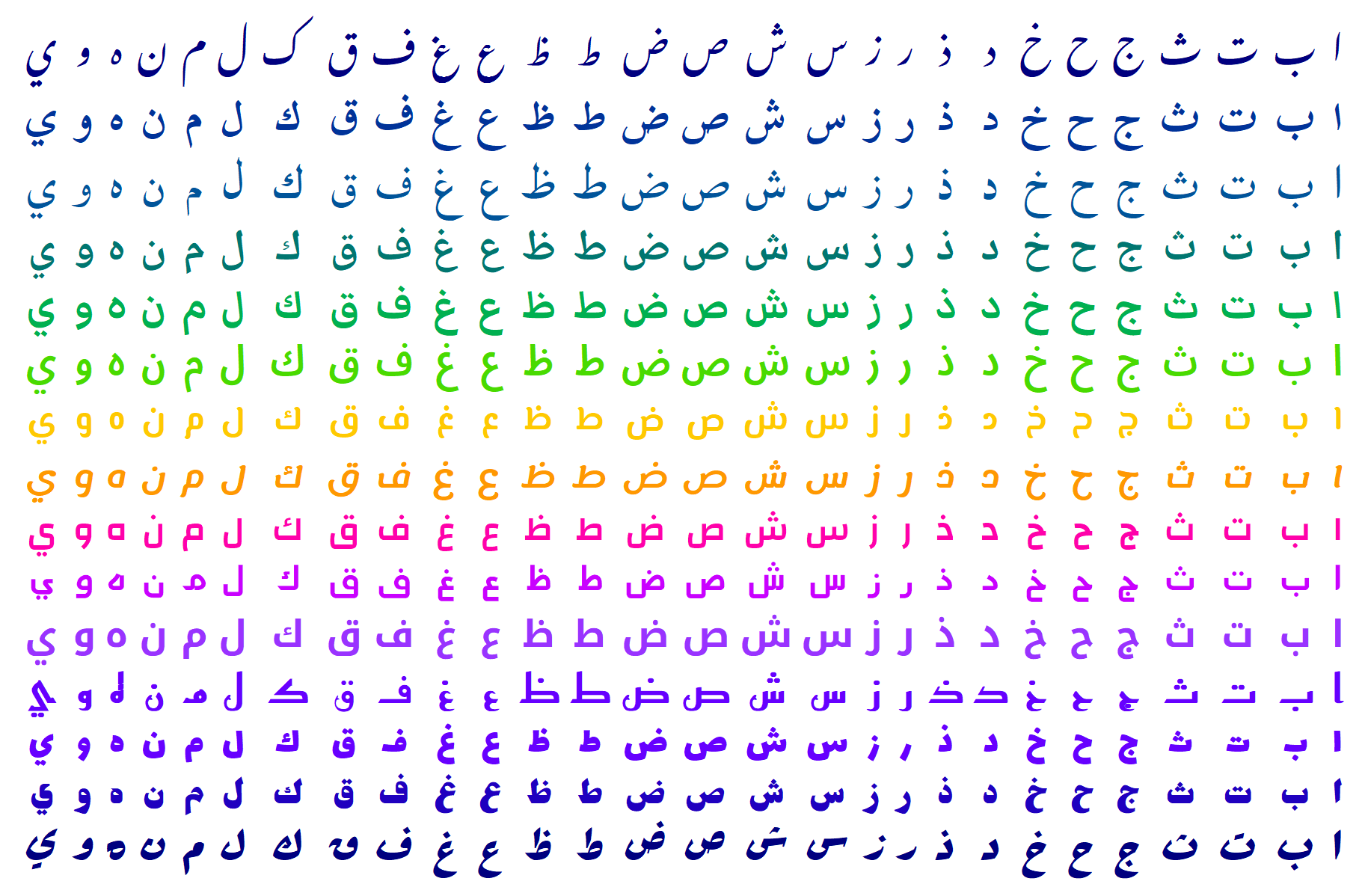
One of the advantages of Arabic calligraphy for typography use is the cursive aspect, which really can open rooms for a lot of fun and creative areas to sculpt a font. We are dealing basically with a modern geometric line with both the two versions of the font (WW3 Inktrap and WW3 Sans), with a different purpose for each, and yet in a design proportion to the original Latin font.
The Inktrap font is generally intended for large titles, and it is the main WW3 brand font. What distinguishes it from other fonts is the overlapping of drawing letters with Inktrap, and it was a priority for the design of an Arabic font that suits it. The WW3 Sans font is the second one dedicated to certain aspect of the in-game text but also our out-of-game content (in the form of body of the text), such as blog pieces and subtitles.
The Inktrap font is generally intended for large titles, and it is the main WW3 brand font. What distinguishes it from other fonts is the overlapping of drawing letters with Inktrap, and it was a priority for the design of an Arabic font that suits it. The WW3 Sans font is the second one dedicated to certain aspect of the in-game text but also our out-of-game content (in the form of body of the text), such as blog pieces and subtitles.
How did we adapt a Latin font to Arabic?
Before we started designing the font, we took a careful approach of current brand in the Latin font, which features a modern geometric font that overlaps its Inktrap letters. It’s a mix of characters free or full of these tiny little inner cuts that makes the Inktrap font original. In Arabic, this was taken into consideration to build the calligraphy on the structure of a Kufic script - a style of Arabic writing that is used prominently in Qur'anic transcription and architectural decoration – which is the best case of usage for modern engineering scripts adaptation.
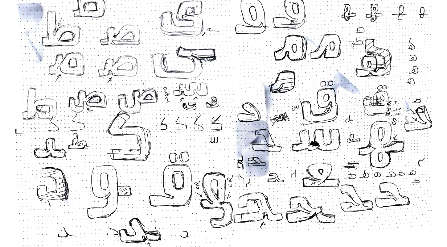
Handmade sketches were drawn to visualize the ideas of these cuts implemented on good old paper, and shape each of the 28 Arabic letters with a transposition of curves, angles and other forms of the Latin-based font. Once the sketches look good or aesthetically better, the concept transfer from paper to digital tools such such as Glyphs App, which thankfully supports the design of Arabic calligraphy.
Handmade sketches were drawn to visualize the ideas of these cuts implemented on good old paper, and shape each of the 28 Arabic letters with a transposition of curves, angles and other forms of the Latin-based font. Once the sketches look good or aesthetically better, the concept transfer from paper to digital tools such such as Glyphs App, which thankfully supports the design of Arabic calligraphy.
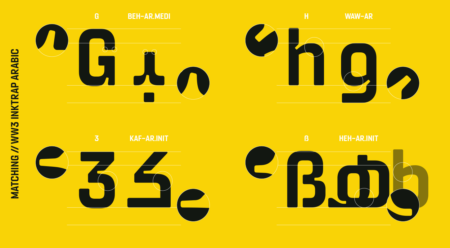
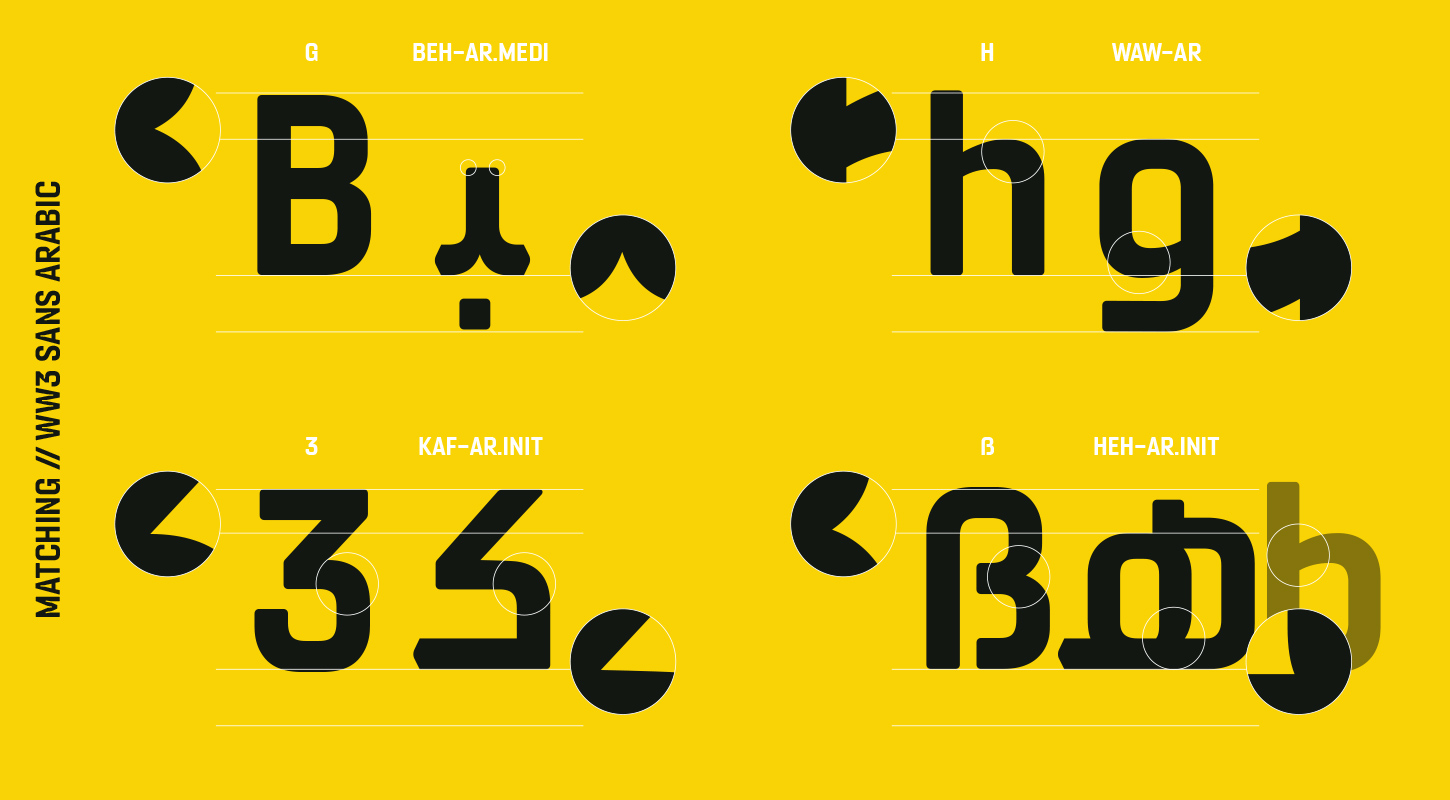
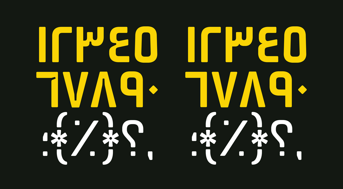
The base letters in the Arabic WW3 Inktrap font were completely designed via experimentation of different forms of the letters in a word. Since Arabic letters do get altered in shapes due to the cursive nature of the language, we must see the implementation of each of the 28 letters fitting together (more than 370 different combinations). Once that base font was approved by our team, our designer moved to another stage to finish the design of the entire auxiliary letters including diacritics, punctuations but also two different style of numerals such as Hindu-Arabic numerals (also known as Eastern Arabic numerals) symbols and Arabic numerals (the numbers most world nations uses after their introduction in Europe in the tenth century by Arabic speakers of Spain and North Africa).
Wrapping this up, the focus went to the WW3 Sans font, meant for longform writing and text body. To differentiate that font with the Inktrap one, we had to simplify the latter by removing all tiny cuts presents in the characters.
We hope you enjoyed learning about our thought process while designing those two fonts for our upcoming game World War 3. You can already see a touch of its implementation on our official WW3 pages on social media such as Twitter, Instagram and Facebook, on top of the official site.
We hope you enjoyed learning about our thought process while designing those two fonts for our upcoming game World War 3. You can already see a touch of its implementation on our official WW3 pages on social media such as Twitter, Instagram and Facebook, on top of the official site.


